> For the complete documentation index, see [llms.txt](https://help.openloyalty.io/llms.txt). Markdown versions of documentation pages are available by appending `.md` to page URLs; this page is available as [Markdown](https://help.openloyalty.io/gamification/tiers/tier-analytics.md).
# Tier Analytics
This section explains how to use and interpret Tier Analytics.
***
### Analytics
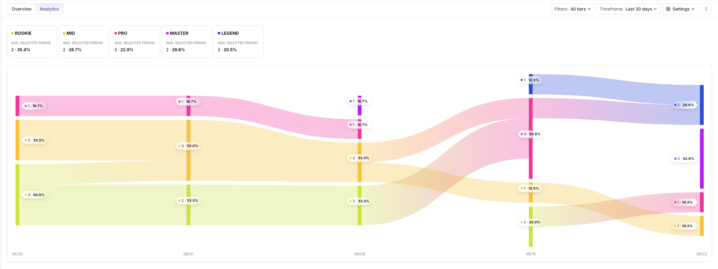
The analytics chart shows how members flow between tiers over time - how many upgraded, how many downgraded, and how many stayed.
Open it from the tier set's **Analytics** tab. On your first visit, a short tutorial ("See where your members go - and why") introduces the chart; choose **Skip tutorial** or **Explore**. You can reopen it later from the ⋮ menu at the top right.
The chart is interactive:
* **Click a tier** in the **legend** to show or hide it.
* **Hover over a flow** to see the exact number and percentage of members that moved between tiers.
{% hint style="danger" %}
**When a tier has low member volume**
When a tier contains very few members, its flow data may be statistically insignificant or visually too small to render reliably on the main chart. To avoid misleading representations, this data is hidden from the overview.
To still analyze this tier, click the tier card to open it in **Isolation Mode**. There, the tier is displayed on its own scale, making even small membership movements visible and meaningful.
{% endhint %}
***
### Isolation Mode
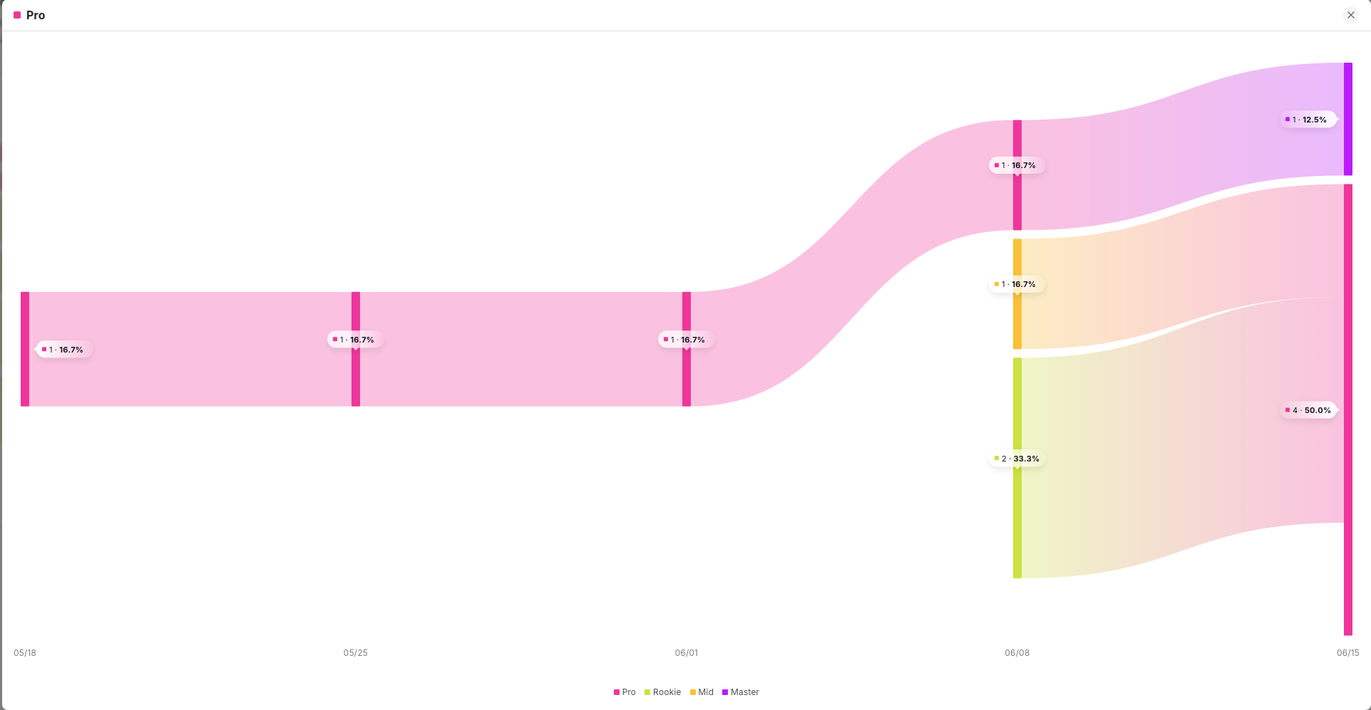
Click a specific analytics chart to open its **Isolation Mode.**
This view allows you to track **comprehensive tier progress** within a specified time range selected in the Analytics section.
You can also open Isolation Mode directly from a tier card: click the card to select it (the other tiers are greyed out), then click the expand icon in its top right corner.
{% hint style="warning" %}
**Isolation Mode timeframe**
Isolation Mode always reflects the time range selected in the main Analytics view - it cannot be changed independently.
If you need to adjust the time range, go back to the main Analytics view and use the **Timeframe** selector. The Isolation Mode chart will update automatically.
{% endhint %}
***
### Timeframe
Use the date selector to adjust the view:
* **Last 7 days** - daily data points
* **Last 30 days** - weekly data points
* **Custom date range** - choose any date range
***
### Filters
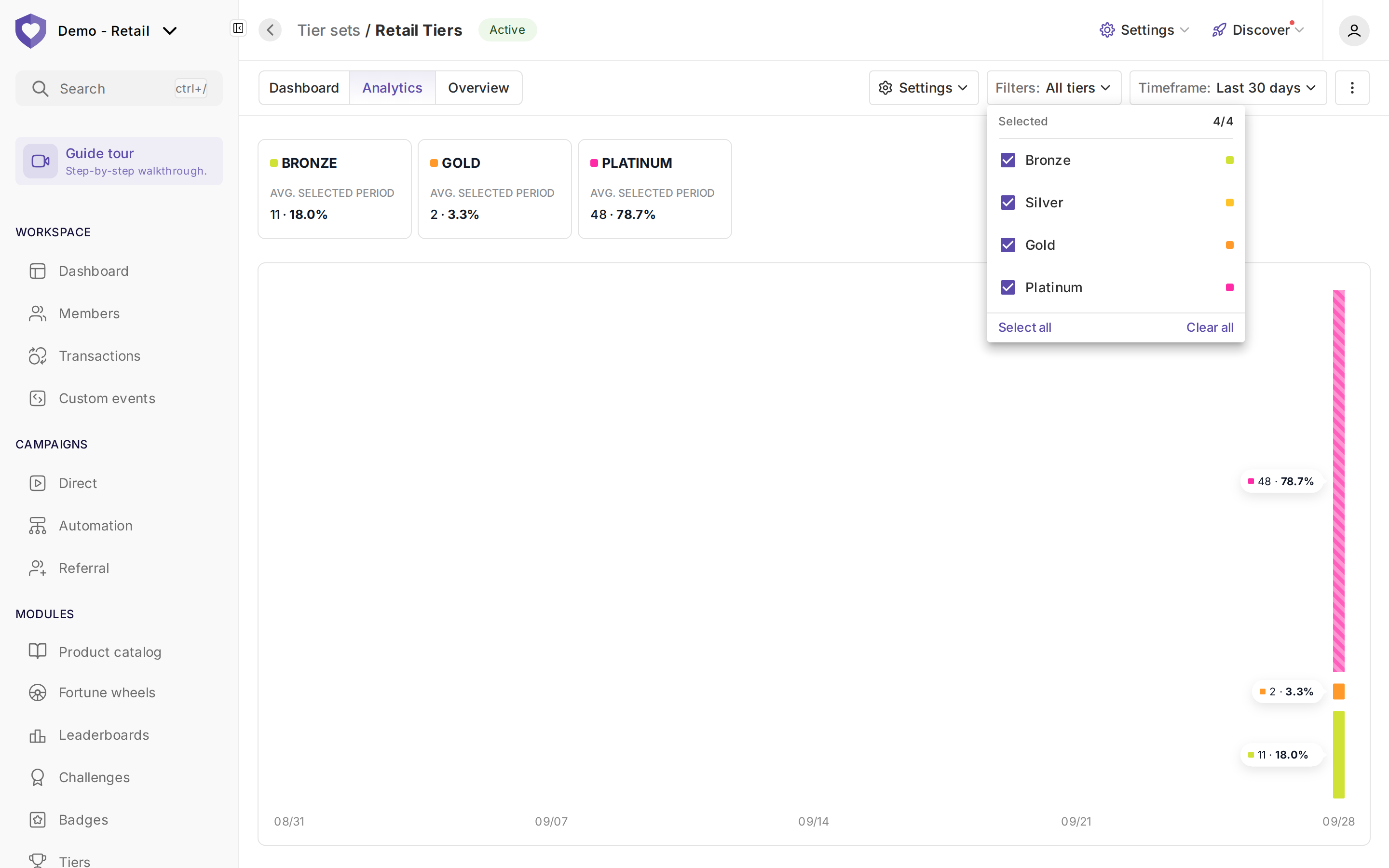
Select which tiers you'd like to analyse in the Tier Movement chart. Your selection will update the dashboard to show only the movement data for the chosen tiers.
{% hint style="warning" %}
**Filter limit reached - 6 tiers maximum.**
You can display up to 6 tiers at once. To add a different tier, deselect one first - this keeps the dashboard readable.
{% endhint %}
***
### Settings
You can customize chart display with these options:
* **Show values on static view** - Display data values directly on the chart without hovering.
* **Show extremely low flows between different tiers** - Include minimal member movements between tiers (may reduce readability)
* **Reduce visibility for the flows between same tiers** - De-emphasize members staying in their tier to focus on cross-tier movement
* **Show inbound and outbound movement for tiers** - Display members entering or leaving your tier set (when available)
***
---
# Agent Instructions
This documentation is published with GitBook. GitBook is the documentation platform designed so that both humans and AI agents can read, navigate, and reason over technical content effectively. Learn more at gitbook.com.
## Querying This Documentation
If you need additional information that is not directly available in this page, you can query the documentation by asking a question.
Perform an HTTP GET request on the following URL with the `ask` and `goal` query parameters:
```
GET https://help.openloyalty.io/gamification/tiers/tier-analytics.md?ask=&goal=
```
`ask` is the immediate question: it should be specific, self-contained, and written in natural language.
`goal` is what the user is ultimately trying to achieve, the reason they need the answer. Sharing it helps GitBook give you a better, more relevant answer. A goal is most helpful when it describes the outcome the user wants rather than restating the question. For example, with `ask=how do I create an API token`, a goal like `automate deployments from our CI pipeline` lets GitBook tailor the answer to that use case.
The response will contain a direct answer to the question and relevant excerpts and sources from the documentation.
Use this mechanism when the answer is not explicitly present in the current page, you need clarification or additional context, or you want to retrieve related documentation sections.


 {% endhint %}
***
### Isolation Mode
Click a specific analytics chart to open its **Isolation Mode.**
{% endhint %}
***
### Isolation Mode
Click a specific analytics chart to open its **Isolation Mode.**